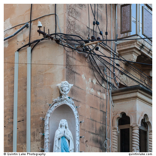
Lovely pictures, thanks for sharing. I especially like the 5th one, which I at first mistook for a drawing – I think it’s the texture of the buildings combined with all those buildings in more or less the same color. I love the way the red pops in the middle of all that beige.
Not to mention Nicolas Roeg’s interpretetation of Daphne du Maurier’s book “Don’t look now” featuring Donald Sutherland and a girl in a red mackintosh…
Hi Hugh, Yes good spot! I had to google it to remember – here’s a review of the film – and the red symbolism – that makes me want to see it again, think I was too young to get what was going on the first time I saw it http://www.theguardian.com/film/2011/jan/18/dont-look-now-red-coat
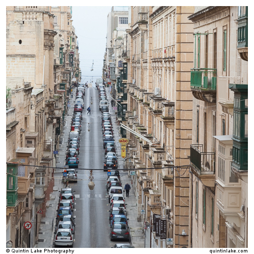
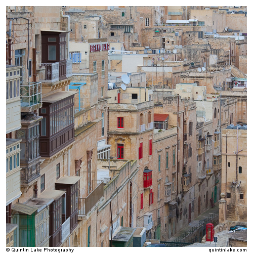
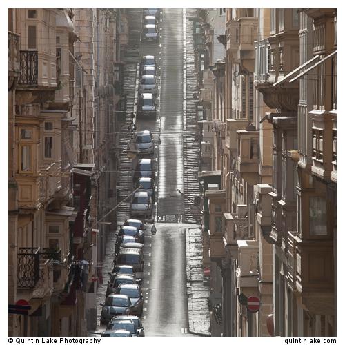
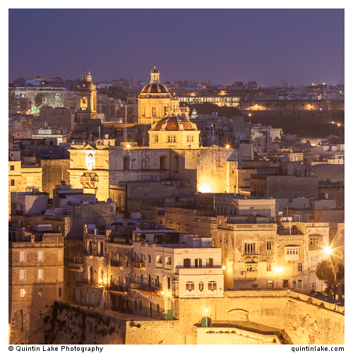


Lovely pictures, thanks for sharing. I especially like the 5th one, which I at first mistook for a drawing – I think it’s the texture of the buildings combined with all those buildings in more or less the same color. I love the way the red pops in the middle of all that beige.
Thanks yes I like the red emphasis amongst subdued colours – its trick used by painters such as Turner in this work http://www.tate.org.uk/art/artworks/turner-boat-and-red-buoy-in-a-choppy-sea-tw0807
Not to mention Nicolas Roeg’s interpretetation of Daphne du Maurier’s book “Don’t look now” featuring Donald Sutherland and a girl in a red mackintosh…
Hi Hugh, Yes good spot! I had to google it to remember – here’s a review of the film – and the red symbolism – that makes me want to see it again, think I was too young to get what was going on the first time I saw it http://www.theguardian.com/film/2011/jan/18/dont-look-now-red-coat